Quantcast
Channel: case study

Illustration Process: Battle by Thomas Rohlfs

$
0
0
Illustration Process: Battle by Thomas Rohlfs

Thomas Rohlfs is an illustrator from Amsterdam, Netherlands with a very unique style. He shared a illustration post on his Behance profile showing a bit of his process from sketches to the final piece. The most amazing thing for me is the sense of movement added by a quite aggressive perspective. In addition to that, the color scheme and textures are top notch.

Illustration Process

abduzeedoMar 27, 2018

TypoStories: a graphical study on typefaces and font pairings

$
0
0
TypoStories: a graphical study on typefaces and font pairingsAoiroStudioMay 31, 2019

Davide Baratta is a design lead based in London, UK and has shared an interesting case study on his Behance. It's an exploration/ case study on typefaces and font pairings titled: TypoStories. It's playful, colorful and a nice exploration from current type foundries (mostly his own favorites). I just love how his series is diversified in terms of creative concepts going all the way from the 90s to pure experimental. Hope you will enjoy!

Typostories is a study about typefaces and font pairings. Started from the need of exploring diverse typographic solutions while staying up to date with the newest releases from my favorite independent type foundries

More Links

Typography

TypoStories: a graphical study on typefaces and font pairingsTypoStories: a graphical study on typefaces and font pairingsTypoStories: a graphical study on typefaces and font pairingsTypoStories: a graphical study on typefaces and font pairingsTypoStories: a graphical study on typefaces and font pairingsTypoStories: a graphical study on typefaces and font pairingsTypoStories: a graphical study on typefaces and font pairingsTypoStories: a graphical study on typefaces and font pairingsTypoStories: a graphical study on typefaces and font pairingsTypoStories: a graphical study on typefaces and font pairingsTypoStories: a graphical study on typefaces and font pairingsTypoStories: a graphical study on typefaces and font pairingsTypoStories: a graphical study on typefaces and font pairings

Redesigning the UI & Shopping Experience for Uniqlo HK app

$
0
0
Redesigning the UI & Shopping Experience for Uniqlo HK appAoiroStudioJul 08, 2019

Zion W is a brand & UI/UX designer based in Sydney, Australia. He shared a great redesign of UI and the shopping experience for one of my favorite clothing brand out there: Uniqlo HK app. I am currently using its North American version and it's a disaster in terms of its entire experience (💡). There are several things from Zion's concept that I dearly appreciate. First and foremost, its user interface is simplified and there is a consistency in the patterns for an e-commerce shopping experience. Another great feature is the 'lookbook', having a visual sneak of what you are buying especially a 'new' collection truly helps create conversions into sales. Give it a look!

The all-new UNIQLO Australia app, with coupons, visual search, store locators, Look Book and other shopping features.

More Links

User Interface Design

More Links

Case Studies Inspiration: A Roundup by aida pacheva, Henry Kunjumon and more

$
0
0
Case Studies Inspiration: A Roundup by aida pacheva, Henry Kunjumon and moreAoiroStudioJul 12, 2019

A new Pure Design Inspiration is up! One burst of inspiration roundup to kick it off for the Weekend? Why not! For this week, I decided to pull together a collection of 'case studies' inspiration. Mainly the idea came after publishing my own case study and decided to go for a surf on hand-picked shots from Dribbble. You should also definitely the last shot I included by Lu Yu about 'How to write case studies for your portfolio', an interesting article to read.

In this collection we are featuring the work from aida pacheva, Henry Kunjumon, Piotr Kaźmierczak, Paweł Durczok and more.

More Links

via Dribbble

Case Studies Inspiration: A Roundup by aida pacheva, Henry Kunjumon and moreDesign by aida pacheva

Case Studies Inspiration: A Roundup by aida pacheva, Henry Kunjumon and moreDesign by Henry Kunjumon

Case Studies Inspiration: A Roundup by aida pacheva, Henry Kunjumon and moreDesign by Francois Hoang

Case Studies Inspiration: A Roundup by aida pacheva, Henry Kunjumon and moreDesign by Piotr Kaźmierczak

Case Studies Inspiration: A Roundup by aida pacheva, Henry Kunjumon and moreDesign by Paweł Durczok

Case Studies Inspiration: A Roundup by aida pacheva, Henry Kunjumon and moreDesign by YuRi Na

Case Studies Inspiration: A Roundup by aida pacheva, Henry Kunjumon and moreDesign by adiatma bani

Case Studies Inspiration: A Roundup by aida pacheva, Henry Kunjumon and moreDesign by Craig Garner

Case Studies Inspiration: A Roundup by aida pacheva, Henry Kunjumon and moreDesign by Iweibo Samuel

Case Studies Inspiration: A Roundup by aida pacheva, Henry Kunjumon and moreDesign by Filip Justić

Case Studies Inspiration: A Roundup by aida pacheva, Henry Kunjumon and moreDesign by Nitin Bhatnagar

Case Studies Inspiration: A Roundup by aida pacheva, Henry Kunjumon and moreDesign by Dale Bandoni

Case Studies Inspiration: A Roundup by aida pacheva, Henry Kunjumon and moreDesign by Lu Yu

UX Case Study: The Dia App for Diabetes Control

$
0
0
UX Case Study: The Dia App for Diabetes ControlAoiroStudio0122—21

The fine folks from Fireart Studio has shared a well-documented UX case study on their work for 'The Dia App' which is an application for diabetes control. It's no secret that people with diabetes face a daily challenge that could affect their health on the daily basis. I think giving some sort of control can help ease the process of repetition and how accurate we can support them somehow. First and foremost, kudos to Katerina Krukova for this lovely, detailed case study that is interesting to go through and that is not showcasing meaningless beautiful UI. Always a fun thing to dive into the process, it shows a lot more meaning, information, the 'why' to the final solution. They are common patterns that currently exist but I personally appreciate the reading. Kudos again to the entire team.

Image may contain: person, indoor and clothing

Image may contain: screenshot and abstract

Image may contain: abstract, screenshot and internet

Image may contain: screenshot and abstract

Image may contain: screenshot, abstract and human face

Image may contain: abstract and screenshot

Image may contain: internet

Image may contain: fast food, person and food

Image may contain: abstract and screenshot

Image may contain: screenshot

Image may contain: person, sitting and indoor

Image may contain: screenshot, print and template

Image may contain: abstract and screenshot

Image may contain: screenshot, template and print

Image may contain: abstract and screenshot


Credits

  • Art Direction: Tolik Nguyen
  • Team Lead: Anton Sokol
  • Product Design & Behance Case: Katerina Krukova

Motion Design Case Study — Sky Sports rebrand

$
0
0
Motion Design Case Study — Sky Sports rebrandabduzeedo0407—21

Andrew Popplestone shared an awesome motion design case study for the Sky Sports rebrand. As part of the successful Sky Sports rebrand, Sky Creative Advertising tapped Territory to design new opening titles and content for the dedicated Super League channel. 

With a vision to celebrate Sky's coverage of the sport with fresh energy, the brief included a 45 second opening title sequence for Sky Sports Super League, a 20 second generic Rugby League sequence and multiple bumpers. Designed to tie in with Sky Sports rebranding and its emphasis on personality, Territory was asked to push beyond genre conventions with a modern twist on the spirit of the game. The result is a highly stylised 2D cel animation that features a dynamic collage of all the Super League team mascots. Created to tell the story of the battle for the championship, the title sequence conveys the energy, drama and passion of the sport.

Case Study

Style Frames

RUGBY LEAGUE Sequence Frames

Look Development

SUPER LEAGUE Sequence Frames

Credits

  • Produced at Territory Studio
  • Creative Director - Andrew Popplestone
  • Lead CG Artists - Sam Munnings & Ashley Pay
  • Lead 2D Artist - Javier Ren
  • Producer - Joy Whilby
  • Sky Sports
  • Executive Creative Director - Ceri Sampson
  • Design Director - Chris Sharpe
  • Senior Designer - Brad Le Riche
  • Senior Producer - Sophie Brooks

Redesign of Rudo and Tecnico Tequila Labels

$
0
0
Redesign of Rudo and Tecnico Tequila Labelsabduzeedo0416—21

Anton Burmistrov shared a beautiful branding and illustration work for the redesign of the Rudo and Tecnico tequila labels. Tequilas Rudo and Tecnico are inspired by Lucha Libre, an extremely popular Mexican style of professional wrestling, and its rich cultural tradition. All Lucha matches are based on the eternal battle between forces of good and evil, represented by two groups of wrestlers: Tecnicos, noble fighters and heroes, and the famous villains of the sport, brawlers and rule-breakers, Rudos.

All Lucha matches are based on the eternal battle between forces of good and evil, represented by two groups of wrestlers: Tecnicos, noble fighters and heroes, and the famous villains of the sport, brawlers and rule-breakers, Rudos.

The essence of Lucha is in its cool, edgy and mysterious style, so the design of Rudo and Tecnico tequilas is based on the intricate masks worn by Lucha Libre wrestlers

Problem

The issue with the previous Rudo and Tecnico labels was in its comic book-style illustrations which were confusing for the consumer and made the product look “cheap” and gimmicky. Each age expression within the brand featured different wrestlers' figures, cluttering the brand message. There were too many colors involved and intermingled between the two products, which make it difficult for people to distinguish between the Rudo and Tecnico brands. The paper used for the labels is thin, metallic and did not highlight the artisanal origins of the products.


Process

Image may contain: drawing, sketch and illustration

Solution

The essence of Lucha is in its cool, edgy and mysterious style, so the design of Rudo and Tecnico tequilas is based on the intricate masks worn by Lucha Libre wrestlers. Lucha mask is the main centre piece and a visual anchor, surrounded by the elements that underscore the fascinating cultural tradition — the hand-drawn typography, illustrations and Victorian flourishes.

Tequilas are bottled into semi-artisanal, recycled Mexican glass. Laser-cut wooden tops bear design of a wrestling mask. This is an original and unique feature to the brand. Labels are printed on premium robust stock with gold ink finish. The colour of labels is based on tequila's maturity i.e. Blanco tequilas have the smallest aging period and are in pale color, when the mature color of Anejo is complemented by darker tones and golden ink.

Image may contain: coinImage may contain: closeup and abstract

Credits

  • Client — Double Eagle Imports
  • Design — Anton Burmistrov
  • 3d visuals — Gareth Chang

For more information make sure to check out

I, THE QUEEN — Branding Case Study

$
0
0
I, THE QUEEN — Branding Case Studyabduzeedo0817—21

Scepter & Sword Wine Co. produces premium, yet approachable wines from Columbia Valley, WA, one of the world’s most exciting up-and-coming wine producing regions.  But this is a wine company unlike any other.  It was founded with the mission of building a wine-oriented, experiential platform to help inspire curiosity, provoke discussion and challenge perceptions around social equality while celebrating female empowerment. 

Boldly Turning Social Conventions Upside Down

Case Study

Mubien Brands + Workshop Built (MB+WB) was tasked to design, create and develop the entire experience:  

  • Brand strategy
  • Brand concept
  • Brand architecture
  • Verbal brand
  • Copywriting
  • Visual brand identity
  • Company naming
  • Product naming 
  • Packaging design 
  • Website
  • Go-to-market strategy
  • Collateral design
  • Art Direction 
  • Photography Direction
  • Video Direction
  • Social Media Management

First, what the research said

With this bold mission in mind, we scoured the research in a hunt for insights. Wine has been around forever, and we knew that it was the least innovative of the major alcohol categories (why should beer and spirits have all the fun, right?), but we needed to understand where the opportunities were. 

We found what we were looking for:  

  1. Insight #1: Most wine is purchased at a supermarket; while ecommerce is growing quickly
  2. Insight #2: 40% of supermarket wine purchases are made by people who didn’t have a brand choice in mind before they made it to the wine aisle
  3. Insight #3: For half of wine shoppers, brands are important while a quarter say that labels are important in making wine purchase decisions

These insights told us that consumers were open to new offerings, that wine shopping is a bit of an adventure and that the big opportunities are likely going to brands that can stand out from the crowd. 

Building the Brand Foundation

We uncovered the values and propositions that define and motivate the brand essence. At the core of the brand is the desire to motivate social change by challenging perceptions that are formed by misguided social conventions. The idea of provoking critical thinking through a simple experience fascinated us. Is it history or herstory? Why are the stories of brave female monarchs less told than those of their male counterparts? Shouldn’t at least some of history be written by the Victorias? 

A fine wine, it can be argued, is the ultimate device to spark discussion, tell stories and yes, celebrate female empowerment. 

Concept

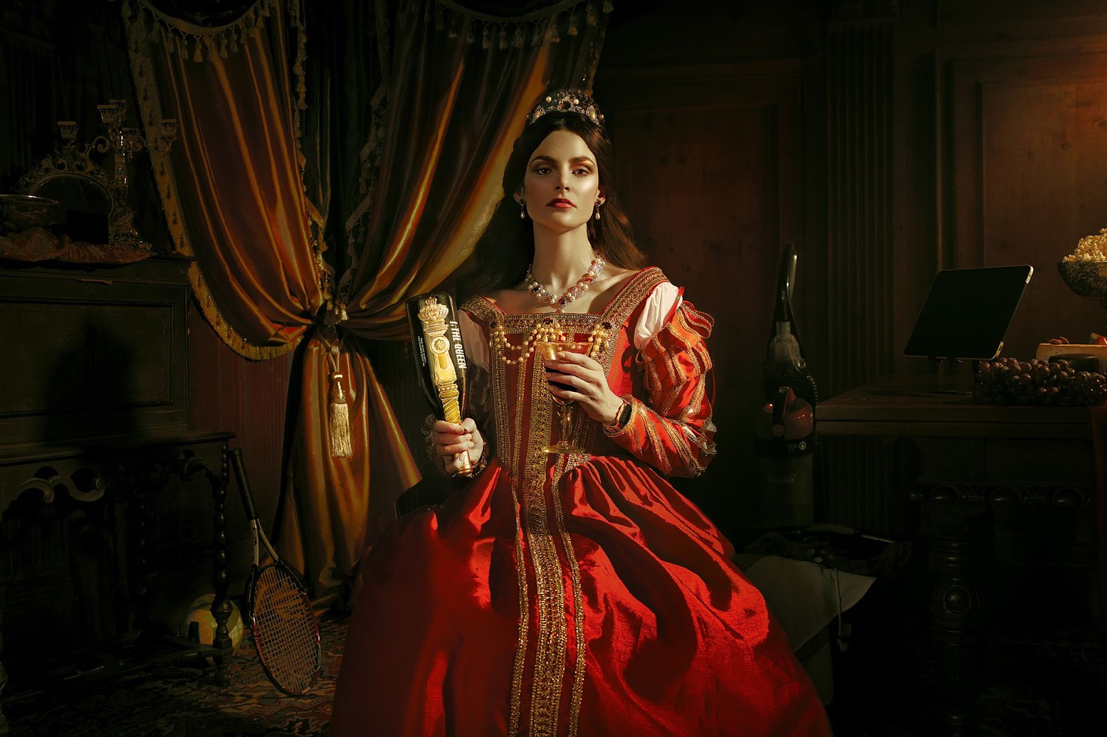
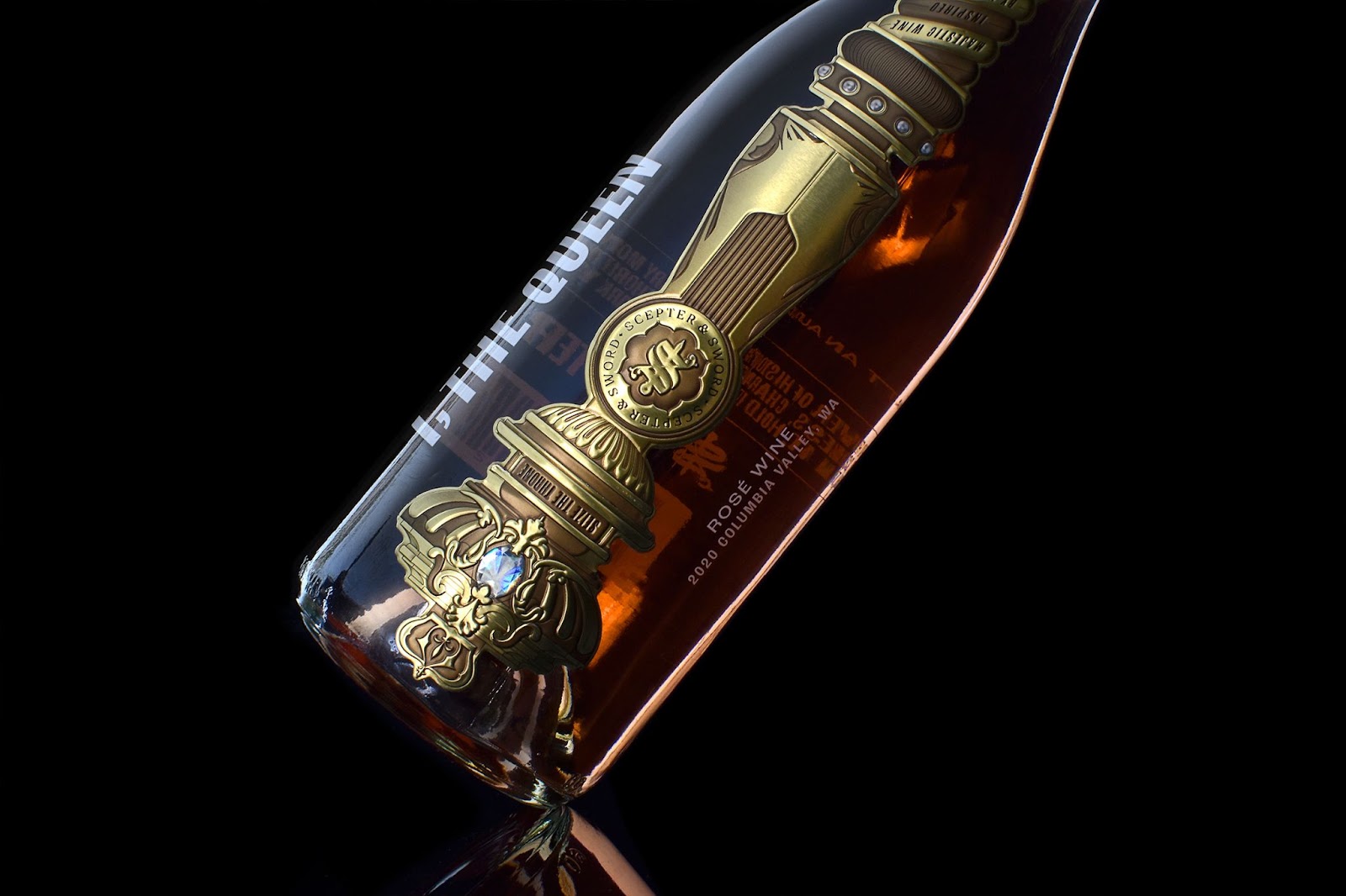
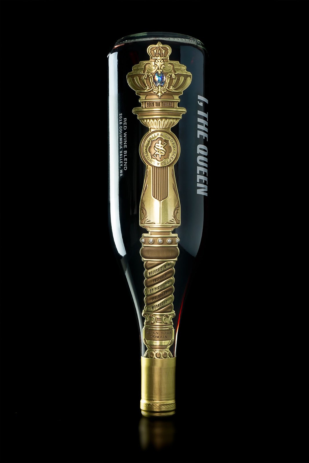
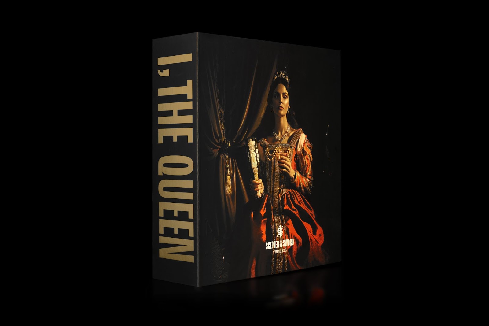
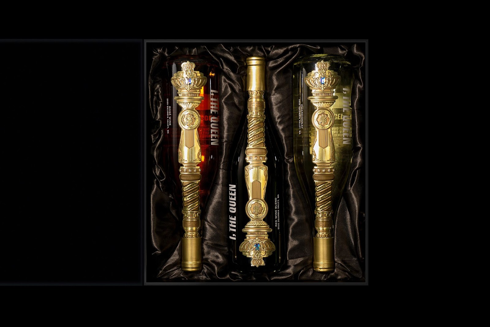
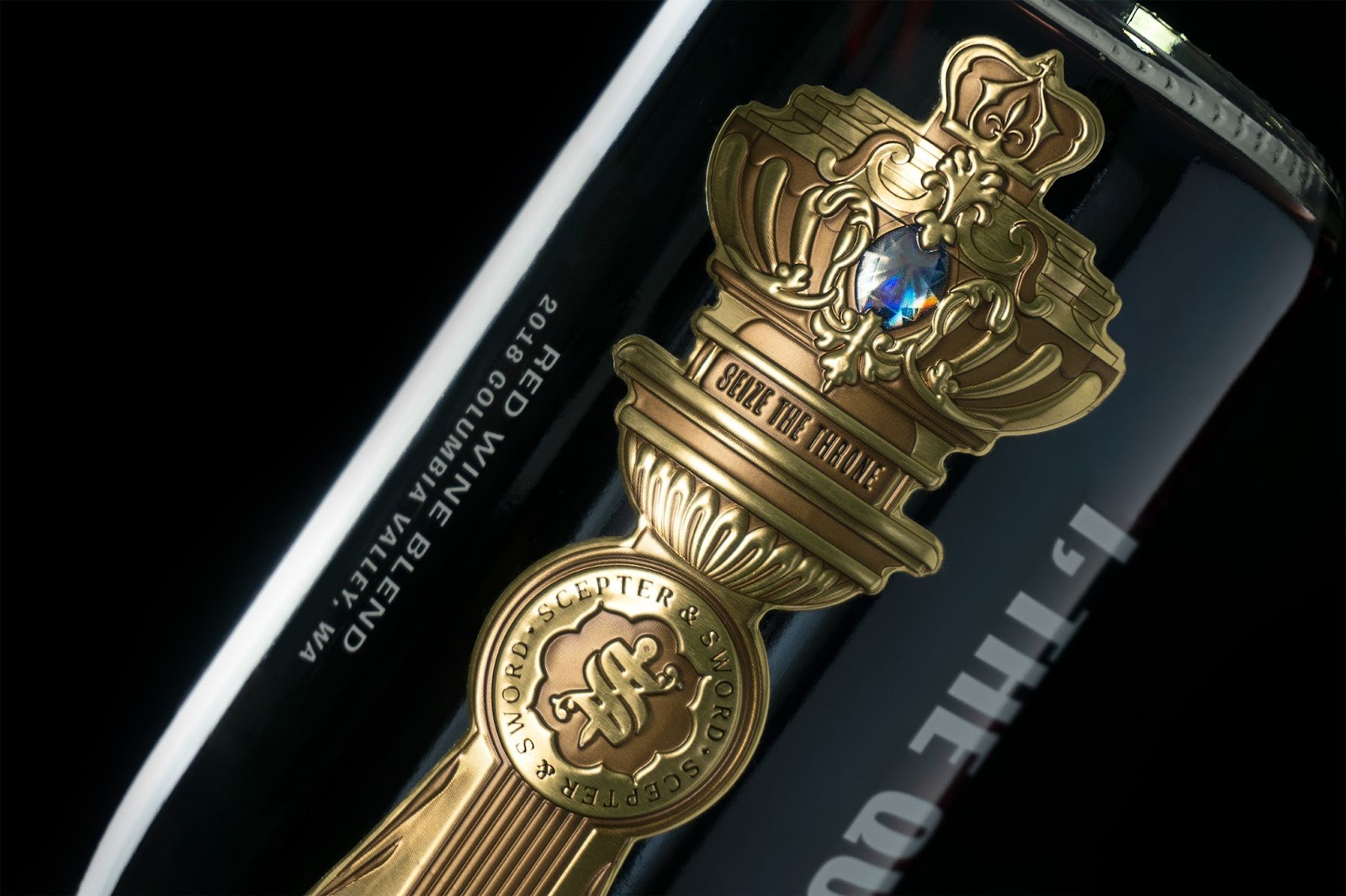
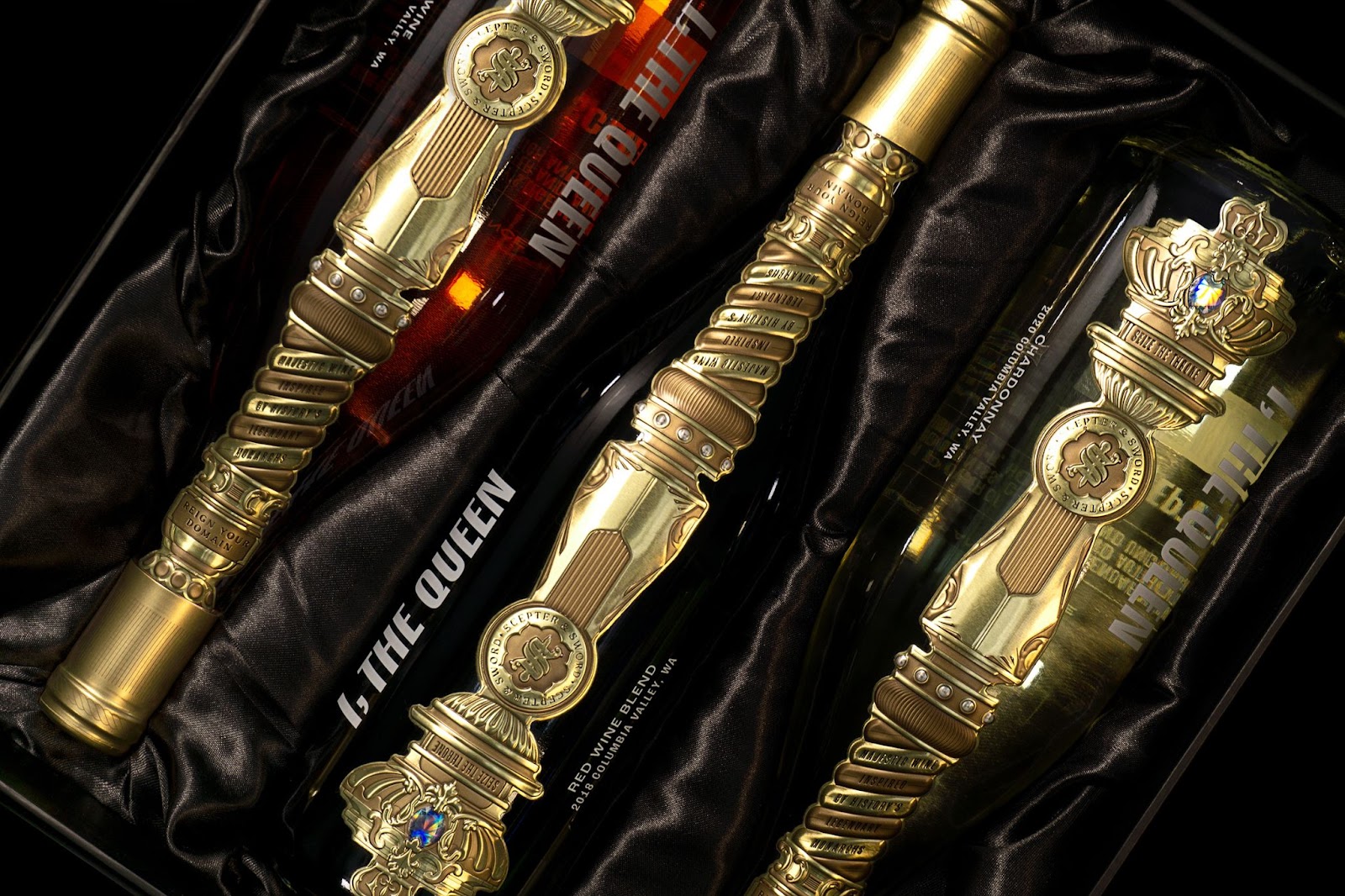
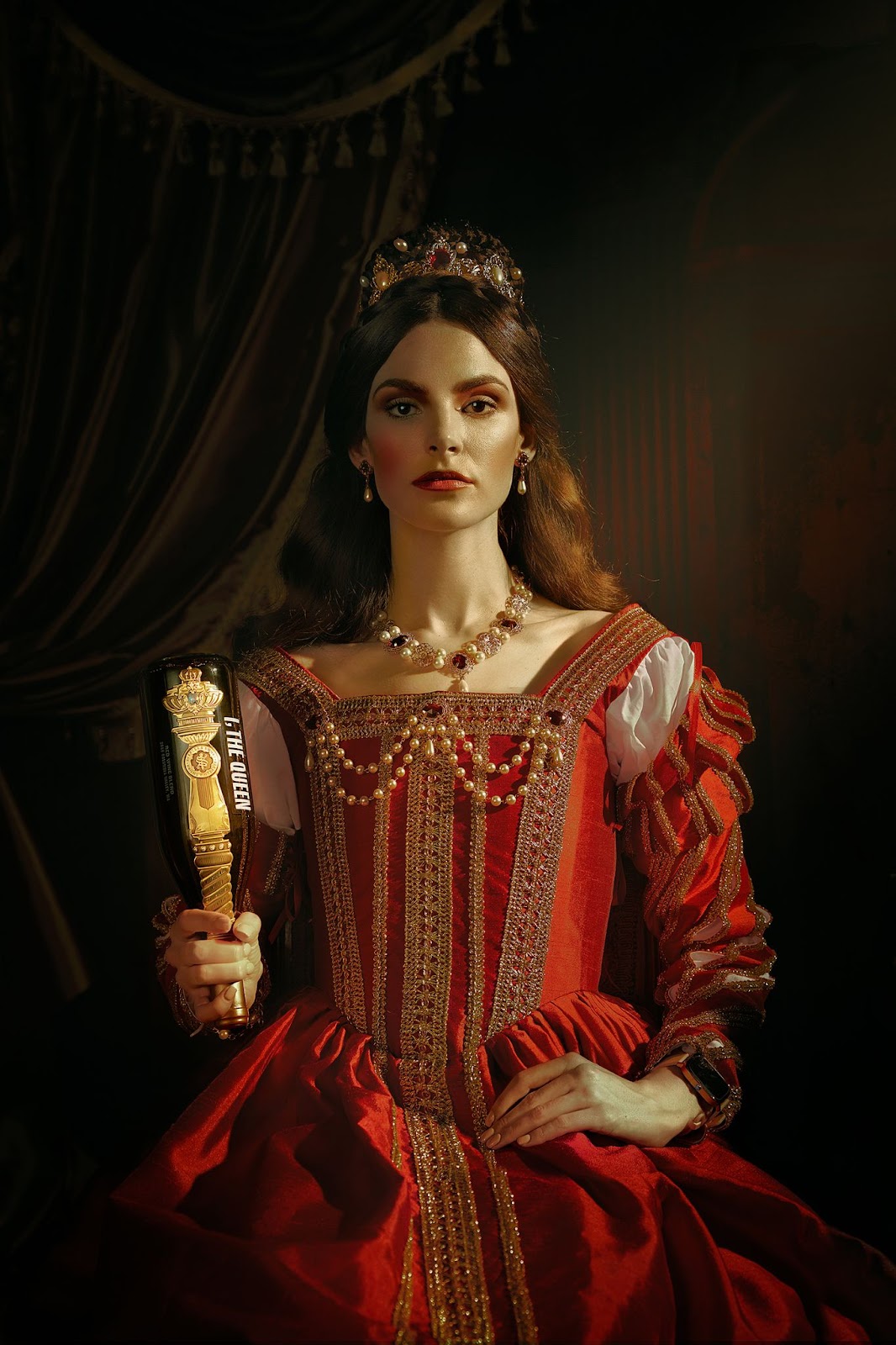
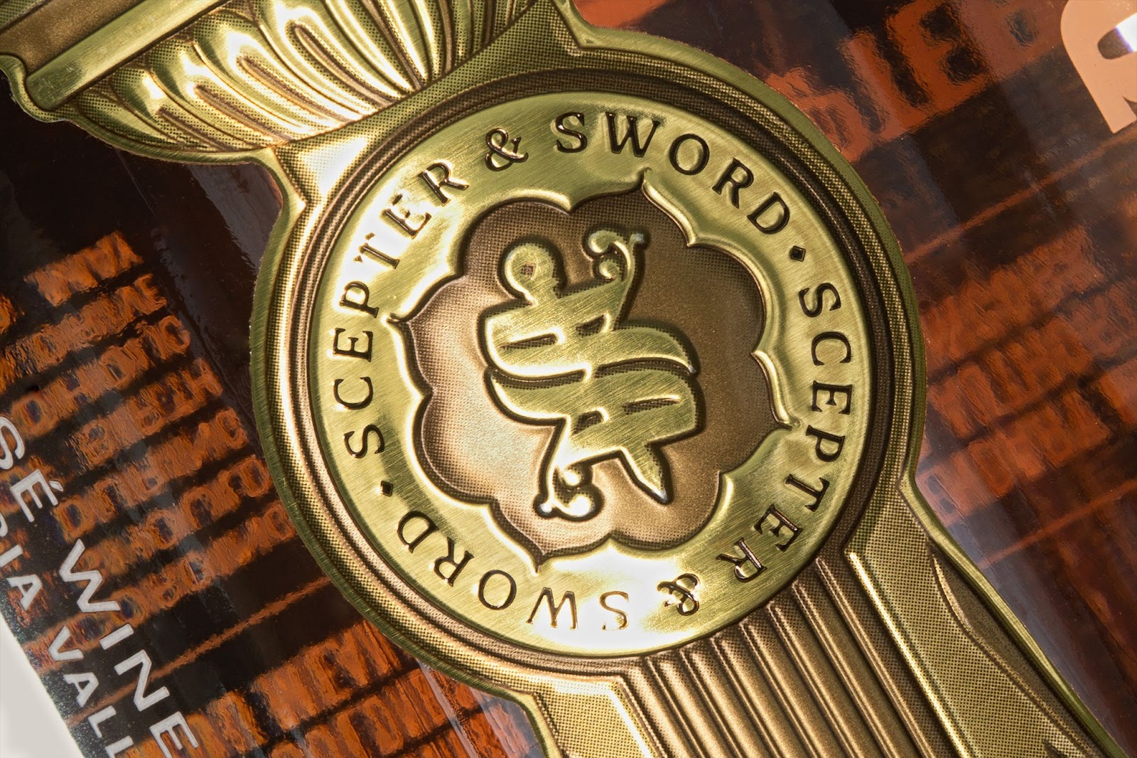
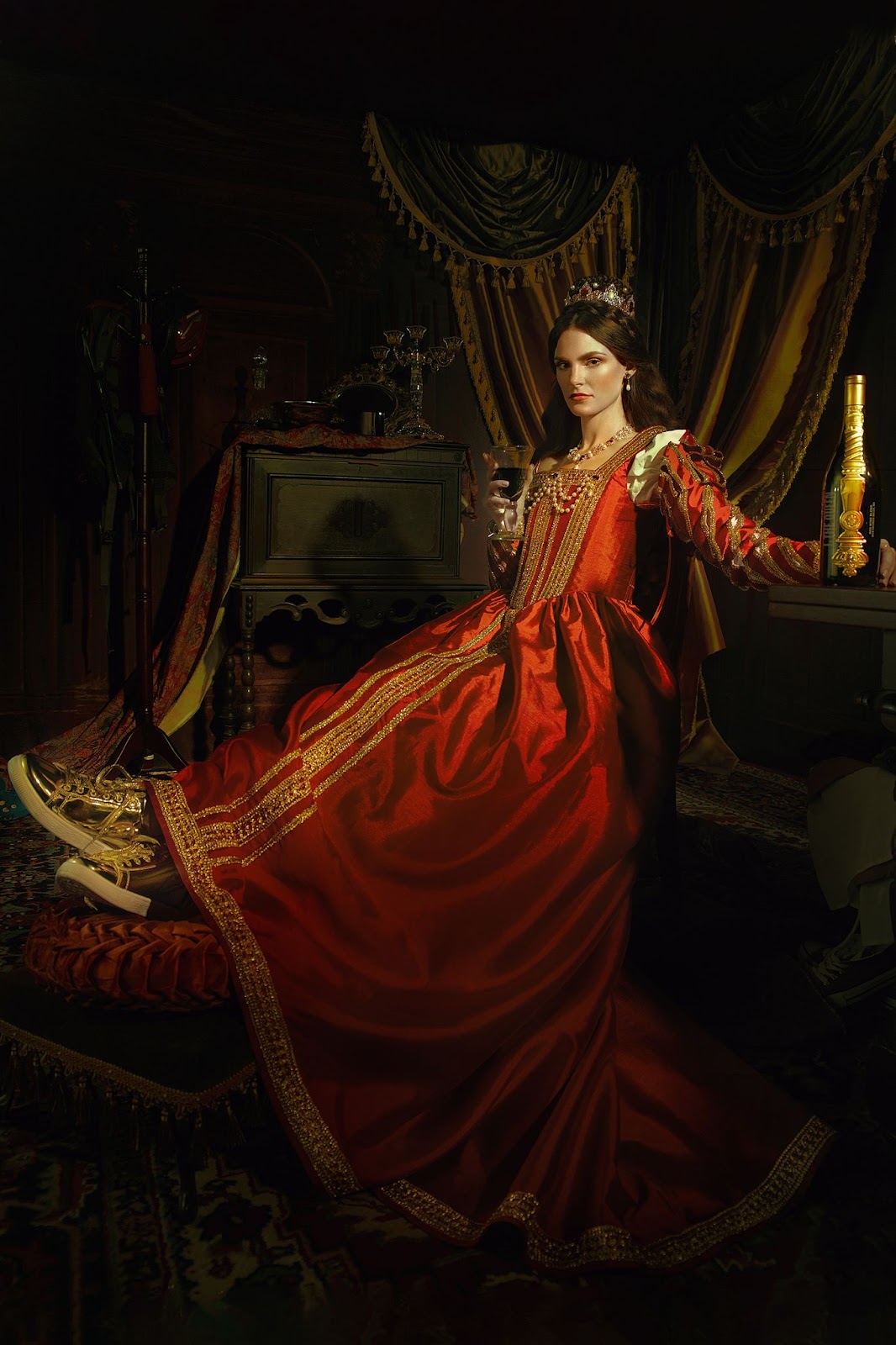
Our team reviewed art museums, books and archives to learn more about the role of Queens through history. The imagery of the scepter became a point of interest as it appears in different shapes and sizes and is present in many cultures throughout history. We also believed that the visual interest of the scepter was bound to inspire curiosity since it is not an object commonly seen or referred to today. With its ornamental design details, sparkling pearls, gleaming gems and gold bling, who wouldn’t do a double-take when encountering one of these? 

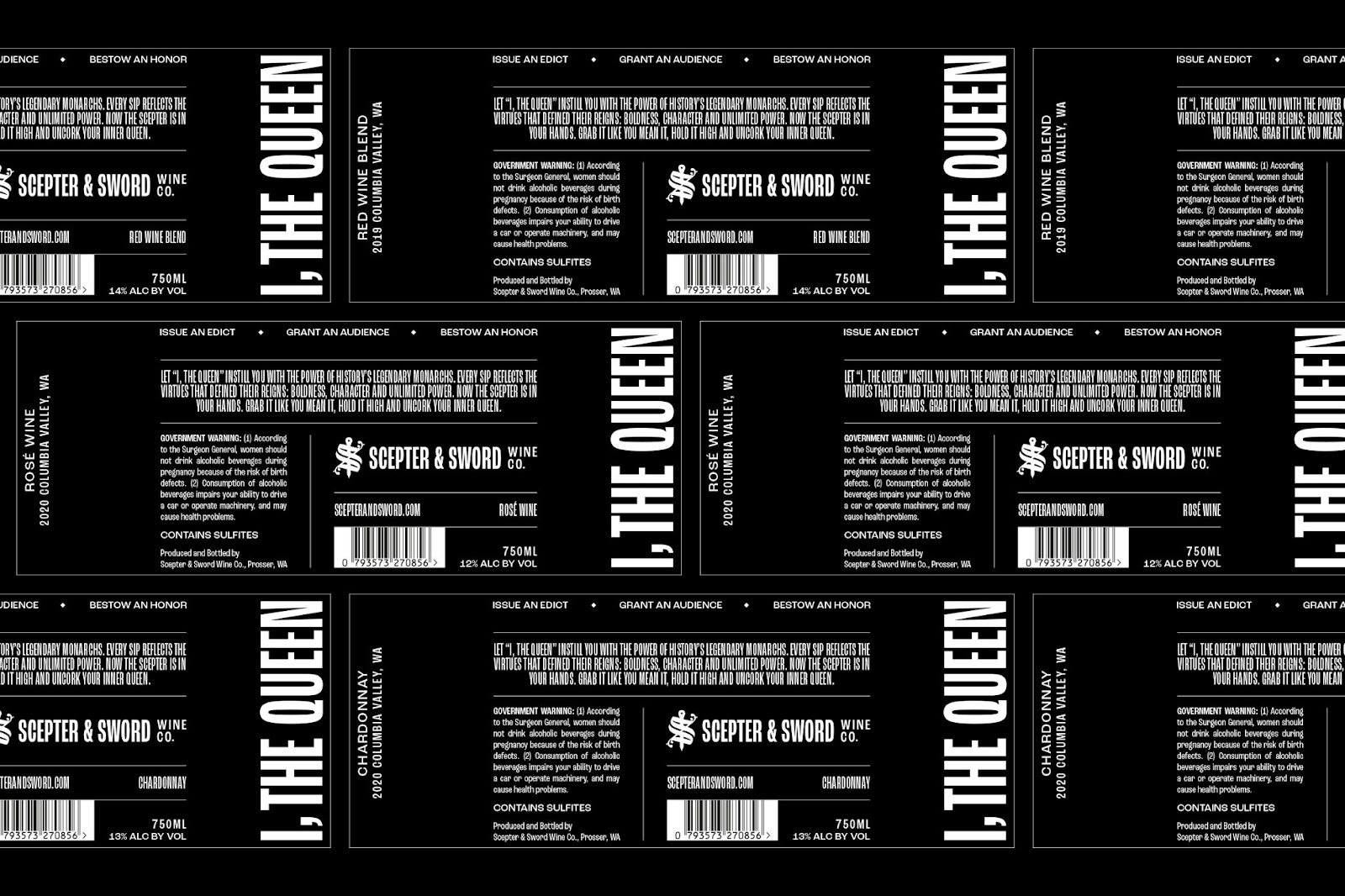
While we designed the entire packaging experience around the historic scepter, we wanted to play freely with the concept of time to produce a relevant brand that makes you think and really question your perception. The packaging reflects this approach, shunning old wine traditions and embracing new ideas: 

  • A label that demands to be turned upside down where it becomes a scepter, the symbol of her authority and empowerment
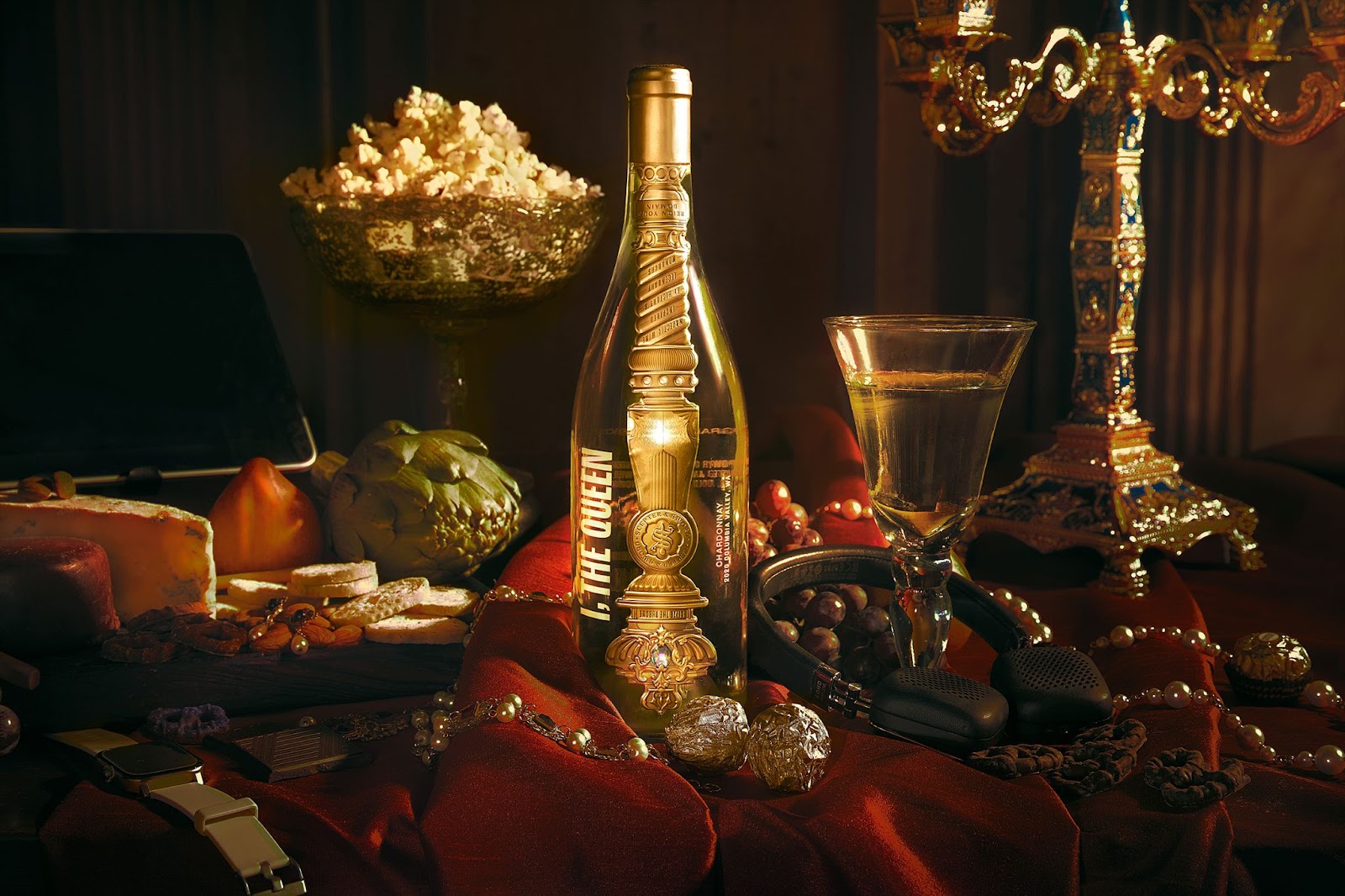
  • Clear glass bottles promote the concept of transparency while allowing customers to see the beautiful colors and hues of the quality wine inside
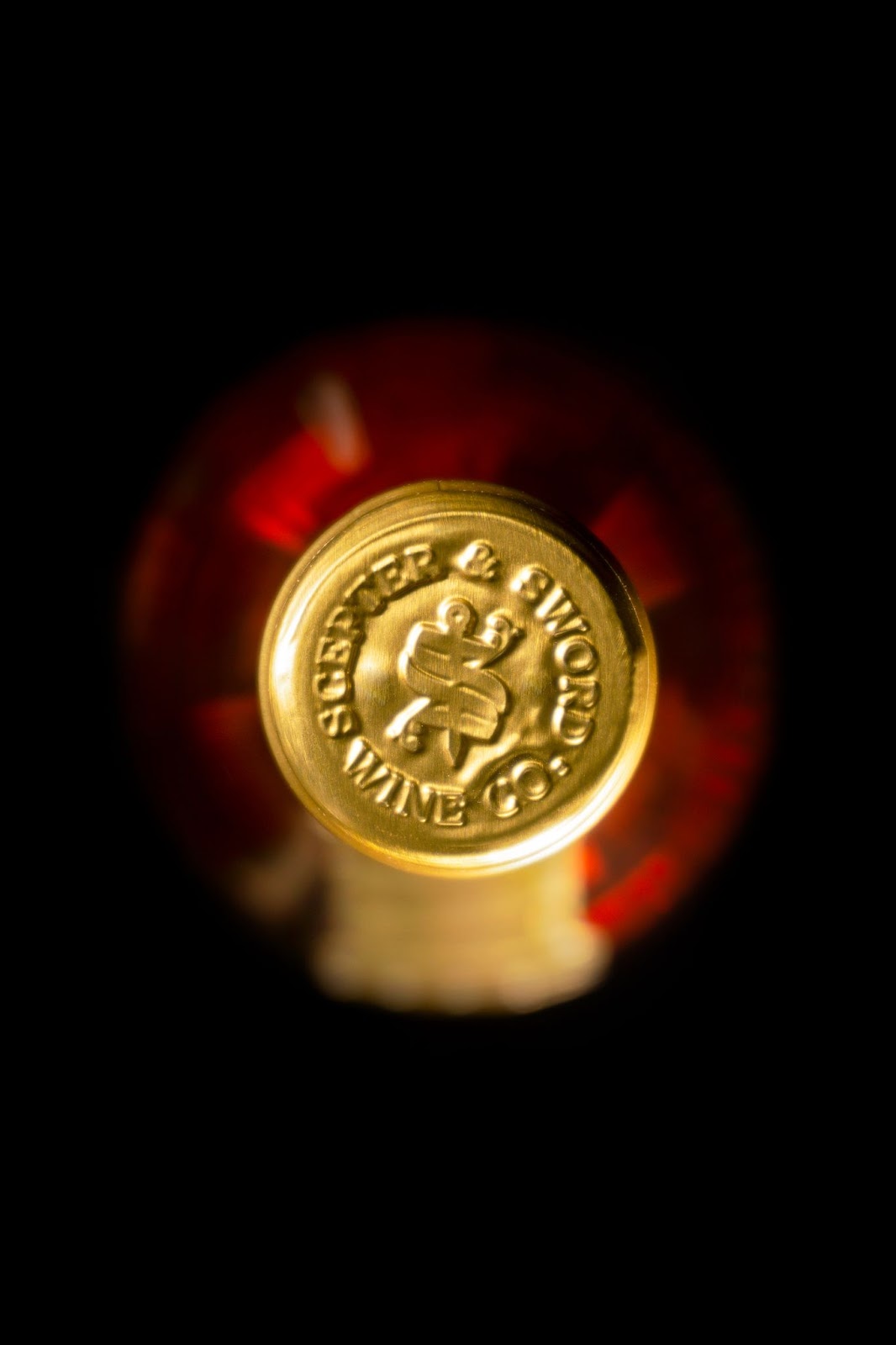
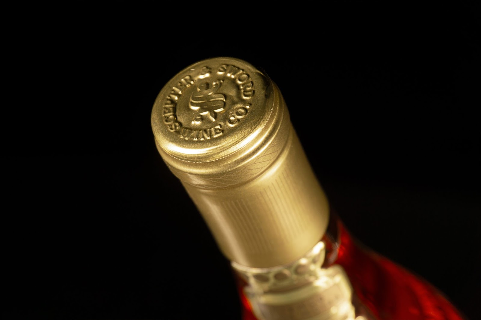
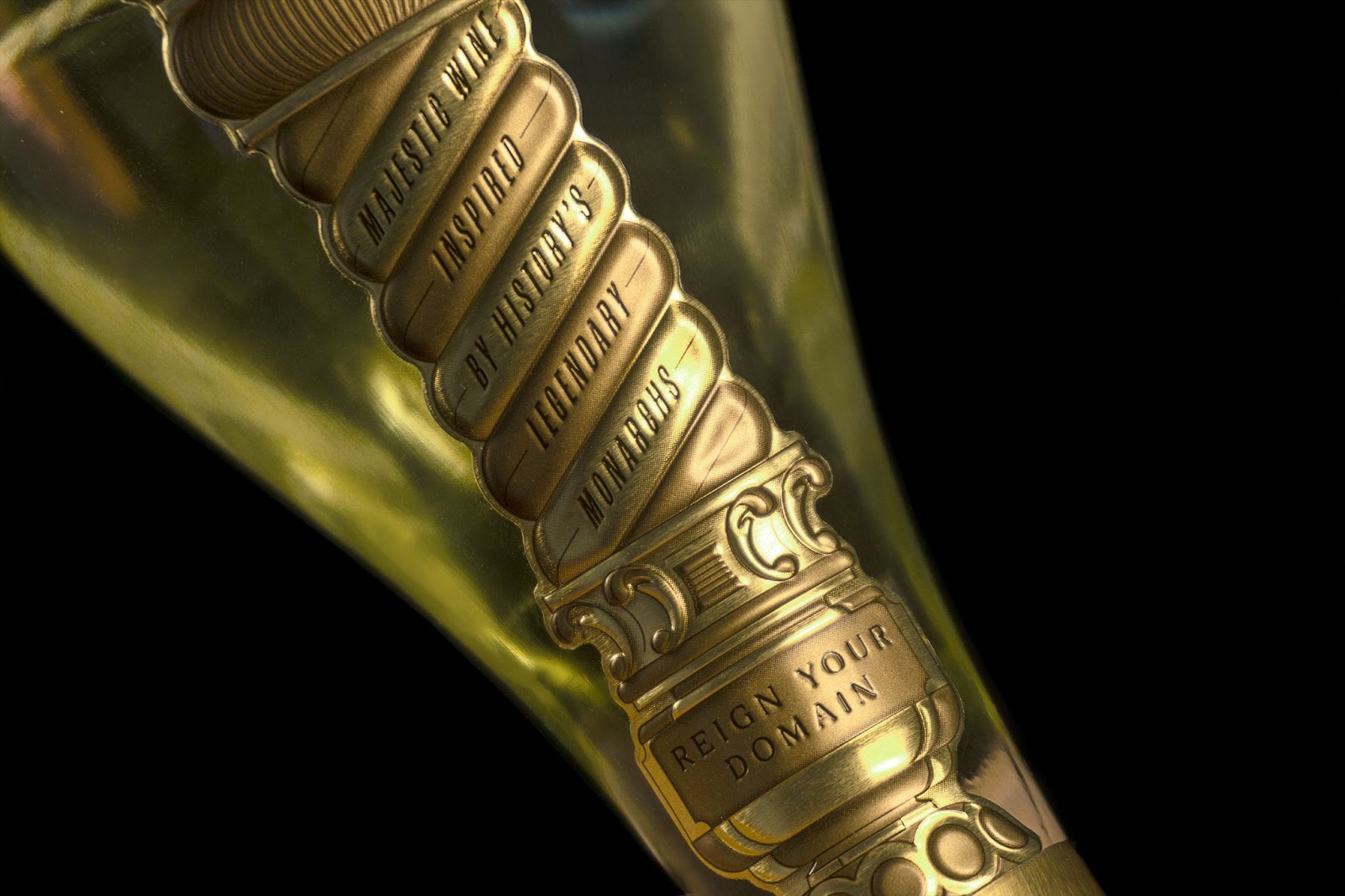
  • Finally we designed a distinctive metallic label application that runs vertically through the entire face of the bottle, from neck to the base

Naming and Brand Architecture

We were tasked with creating the wine company name, a branded product architecture and the product naming conventions.

For the company name, Scepter & Sword immediately resonated because, in addition to being a sweet alliteration, it sounds strong while looking and feeling historic yet interesting to modern audiences. 

Because the company wanted to grow and diversify its wine products, we devised a brand hierarchy to help facilitate the company’s strategy. 

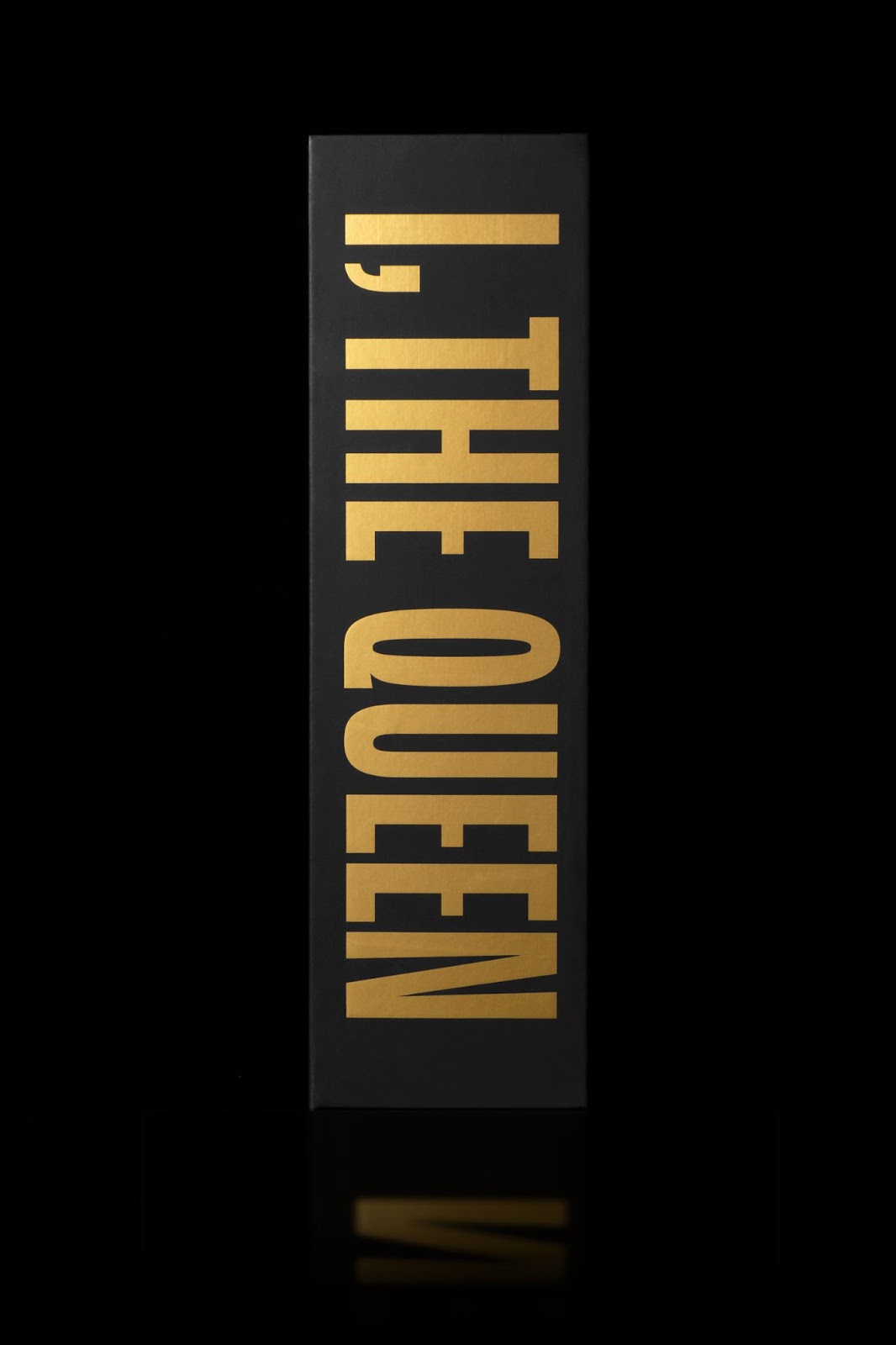
Our approach to naming the wine I, THE QUEEN was inspired by discovering that this statement appeared directly above her signed name on her most important orders, edicts and proclamations… this effectively reflected the symbolism of the scepter while connecting the concept of the queen with a modern day colloquialism.

Visual Direction 

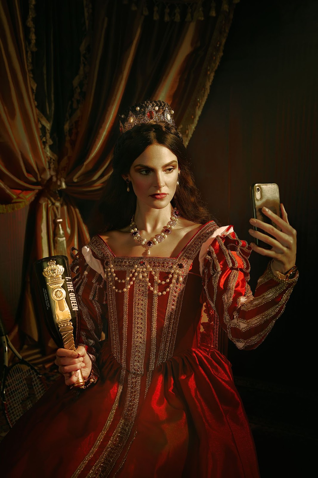
We wanted to seize the opportunity to define our scepter concept through supporting collateral and as a visually-oriented brand, our approach was to use the opportunity to create something that would be eye-catching while respecting the brand’s mission. We were set on recreating a painterly-style photographic application that would challenge the viewer's perception of our conceptual queen. 

Website 

The element of challenging convention and perception is present everywhere the brand is displayed. For the website, we designed and developed a website that delivers the promise of a visually rich and stimulating experience to the user through a variety of touches, including a scroll that moves horizontally instead of vertically. Big, bold imagery and typography guide the user and stunning product photography capture the details of the scepter wine bottles in dramatic fashion. 

Credits 

  • Client: Scepter&Sword Wine Co.
  • Agency: Mubien Brands + Workshop Built
  • Creative Direction: David Mubien, Robert Laplante, Víctor Mubien
  • Art Direction and Label Design: David Mubien
  • UI/UX: Javier Ochoa
  • Web Development: Ángel Pérez
  • Video: Jordyn Roach, EdiciónPRO
  • Motion: Daniel Iglesias
  • Queen Photography: Kate Woodman
  • Model: Madeline Minkema
  • Hair Styling: Andy Tseng
  • Makeup: Amy Gillespie
  • Backdrop/set: BackdropStudio
  • Product Photography: Víctor Mubien, Daniel Iglesias, Rick Starkman
  • Music: Apashe - Good News

For more information make sure to check out https://www.mubien.com


Lungs & You: The Journey — Animation Case Study

$
0
0
Lungs & You: The Journey — Animation Case Studyabduzeedo1118—21

Cream was approached by Wunderman Thompson DC to create an animated TV spot that visualizes the desolate journey of someone suffering with Interstitial Lung Disease (ILD). It aired during a documentary on lung disease and its purpose was to target those who can relate. ILD is a terminal disease that is notoriously difficult to diagnose, and takes an emotional toll on those who are struggling to find answers. Lungs & You offers patients support, resources and guidance and greatly improves their outlook for the precious remaining years they have left.

Here’s the case study with more details about the creative process behind this animated TV spot.

Story Development

The client had a story outline they wanted us to visualize. We follow a person’s frustrating journey as they look for direction, answers and hope through rough terrains and finally into a peaceful environment. Below you’ll see our V1 storyboards which included multiple camera angles to add interest and mystery as each scene is revealed.

Character Development

Our challenge was to create a character that the audience can relate to and empathize with. In the first few scenes he is alone in a drab and desolate place. Confused and frustrated by all of the different paths he could take, he pushes onward despite his struggle to breathe at times. A gentle breeze blows into frame and begins to lead him in the right direction for the remainder of his journey. This new personified companion represents the guidance of Lungs & You. As our character takes each step the breeze is always close by showing him the way. He is finally lead to a lush landscape that feels promising. His outlook is bright, and he's ready for the next chapter in his life.

Environmental Design

Our character’s journey from a desolate terrain into a lush and lively environment is a visual metaphor. Therefore, the background design had to be given a lot of attention.

Lighting & Effects

We decided to bring the environment to life even further by adding lighting and effects that would take the viewer out of the “cartoon” world, and into a more relatable realm. To us, the lighting effects helped to enhance the scenery, while also unifying the character to his environment.

This was a challenging, yet very rewarding project. Lungs & You offers patients support, resources and guidance and greatly improves their outlook for the precious remaining years they have left.

For more information make sure to check out wearecream.com

An insight into redesigning the Midland Appliance logotype

$
0
0
An insight into redesigning the Midland Appliance logotypeabduzeedo0215—23

When it comes to branding, one of the most important elements is the logo. It's the visual representation of your brand, and it's the first thing that customers see when they encounter your business. So, it's no surprise that Full Punch, a design agency, was recently contacted to assist with redesigning the logo of Midland Appliance, a household appliance dealer located in Canada. Here are some insights about the project shared by Paul von Excite

Midland Appliance was founded in 1972, and since then, they've established themselves as a leading dealer in the upscale and luxury segments of the market. With such a long and successful history, it's important that their logo reflects their brand's values and identity. That's where Full Punch comes in.

As an experienced design agency, Full Punch understands the importance of creating a logo that not only looks great but also effectively communicates the essence of the brand. In this case, they were tasked with creating a cursive-style typography that would give Midland Appliance a more refined and sophisticated look.

When it comes to typography, there are countless options available, but cursive is a classic choice that can add elegance and personality to any design. By opting for a cursive style, Full Punch is giving Midland Appliance a more sophisticated and upscale feel, which aligns perfectly with their focus on the luxury market.

But it's not just about the style of the typography - Full Punch also had to consider the color scheme and overall design of the logo. The right combination of colors and shapes can make a big impact on how customers perceive your brand. With Midland Appliance, Full Punch opted for a simple, clean design that emphasizes the typography, with a color scheme that's both modern and timeless.

Overall, the new logo that Full Punch created for Midland Appliance perfectly captures the essence of the brand. It's sophisticated, elegant, and modern, while also paying homage to the brand's long history. This is a great example of how a well-designed logo can enhance a brand's identity and reputation.

If you're looking to redesign your own brand's logo, it's important to work with an experienced design agency that understands the importance of branding and the impact of a great logo. With the right combination of style, color, and design, your logo can be a powerful tool in building a strong and recognizable brand. Check out the case study below.


Sketching

After reviewing the briefing, I started to get a sense of how the letters would work together in a different variety of styles. This immediately gave away that we needed to use the natural flow of the letters to our benefit.  


Concept Development

It was clear we needed to find a middle ground between the top two sketches. Using the flow of the top left sketch and the mono-line thickness of the top right sketch. Besides, adding a more pronounced M which could be used as a stand-alone icon. 

Although definitely an improvement, the "M" felt a bit lost compared to the other characters. I decided to use the top right sketch "M" I made earlier as a reference because it felt more cohesive. 


Image may contain: coin

The middle bottom M felt the best as a wordmark and also as a stand-alone icon. With a small touch, reducing the length of the bottom left stroke, the foundation was set. 


Image may contain: closeup and abstract

Refinement

It still feels a bit wonky overall, which we are going to solve in the final stage.

A few pointers:

  • The ascenders are slightly bent, which need to be straight. 
  • Add extra weight and look at all the line work. 
  • Make sure all the characters have the same italic slant. 
  • Increase the top-line of the M.
  • Reduce size of the "i" dot.


Image may contain: drop

The Final Logo

The time spent to get it visually to this level was totally worth it. It feels cohesive as a whole and the consistency is massively improved.

Image may contain: electric blue and cobalt blue

For more information and to check out more works visit Paul von Excite's website.


Latest Images