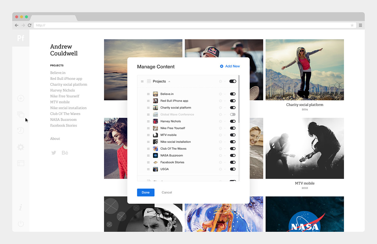
Andrew Couldwell shared a great case study showing the behind the scenes of the design process for Adobe Portfolio which is Adobe's service for designers, photographers and enthusiasts to create beautiful portfolios. I had the chance to play around with it a bit and I quite like it. My only qualm was with the Behance integration, I wish I could have projects there without being on Behance. Perhaps it's possible however I have yet to discover. After this post I will definitely seek this out.
Product Design
The editor must enable the user to quickly and simply edit their portfolio. The UI is very minimal — it gets out of the way and allows you to focus on the design of your website. All changes you make happen live in the editor. We were going for simple, clean and beautiful. It empowers the user to: Easily edit anything they can see, manage and add content, responsively preview their website, and publish/update a live website.
Editor
The editor UI is very minimal, putting the website you are editing front and center. All edits happen live as you edit and you can preview your website responsively on tablet and mobile at any time, in the editor. Everything can be accessed via direct access by hovering over elements and being presented with edit icons and options to edit. Managing and adding content and site settings are all done via the toolbar to the left of the screen. And the draggable remote to the right accesses the main editable features of whatever page you are currently viewing.
Here a couple of images:
Specs
Customizing and layouts
Most layouts by default have aspect ratio cropping enabled for project covers, to unify the presentation and layout of projects in galleries. For me, one of the coolest features in the product is the ability to mass change the aspect ratio (crop) of all covers, so you can very quickly and dramatically change your layout.
For more information and to read the full case study check out the Behance post.


